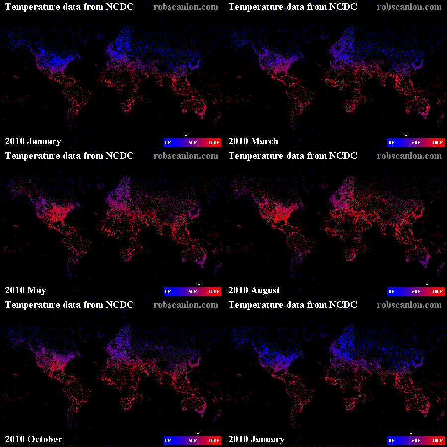
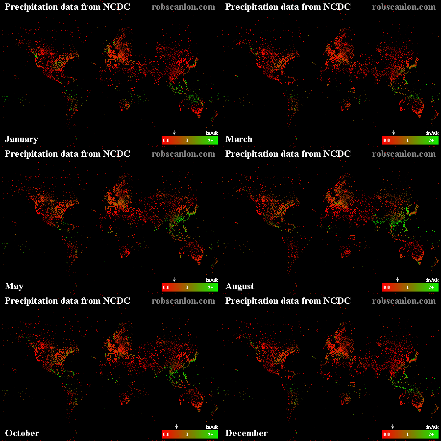
I recently came up with an excuse to work with some large data sets in my spare time. I’ll write more about that project in future posts, but today I wanted to share some quick-and-dirty visualizations of a weather data set that I downloaded from the NCDC while working on that project. After downloading 5 years (and 5 gigs) of weather data, I wanted to get an idea of how complete the data was before I did anything else with it. So I plotted the temperature and average weekly precipitation levels onto a map and animated it. Below is the result:
Each pixel approximately represents a station that collects weather data. The little dancing arrow above the legend represents the average across all data points. This doesn’t really have any meaning outside of this data set, since it is obviously skewed heavily to US and European data (where there are the most data points).
I was pleasantly surprised at the overall quality of the data… I didn’t have high hopes for coverage outside of the United States, but it looks like the rest of the world is well enough covered for my purposes. And for the most part the data looks to be sane.
In case you were wondering, these images were generated using fairly vanilla Java code and mysql queries, along with the help of a nice little map projection library.


